


T-Mobile wanted their 2015 Annual Report to work primarily as an online experience, and we wanted to create a report that could showcase some of the Un-carrier's fun personality alongside the financials.
We used a long scrolling layout comprised of several blocks, which could house deeper-dive content, as well as relevant tweets, pics and videos from T-Mobile's social channels that had been published throughout the year.
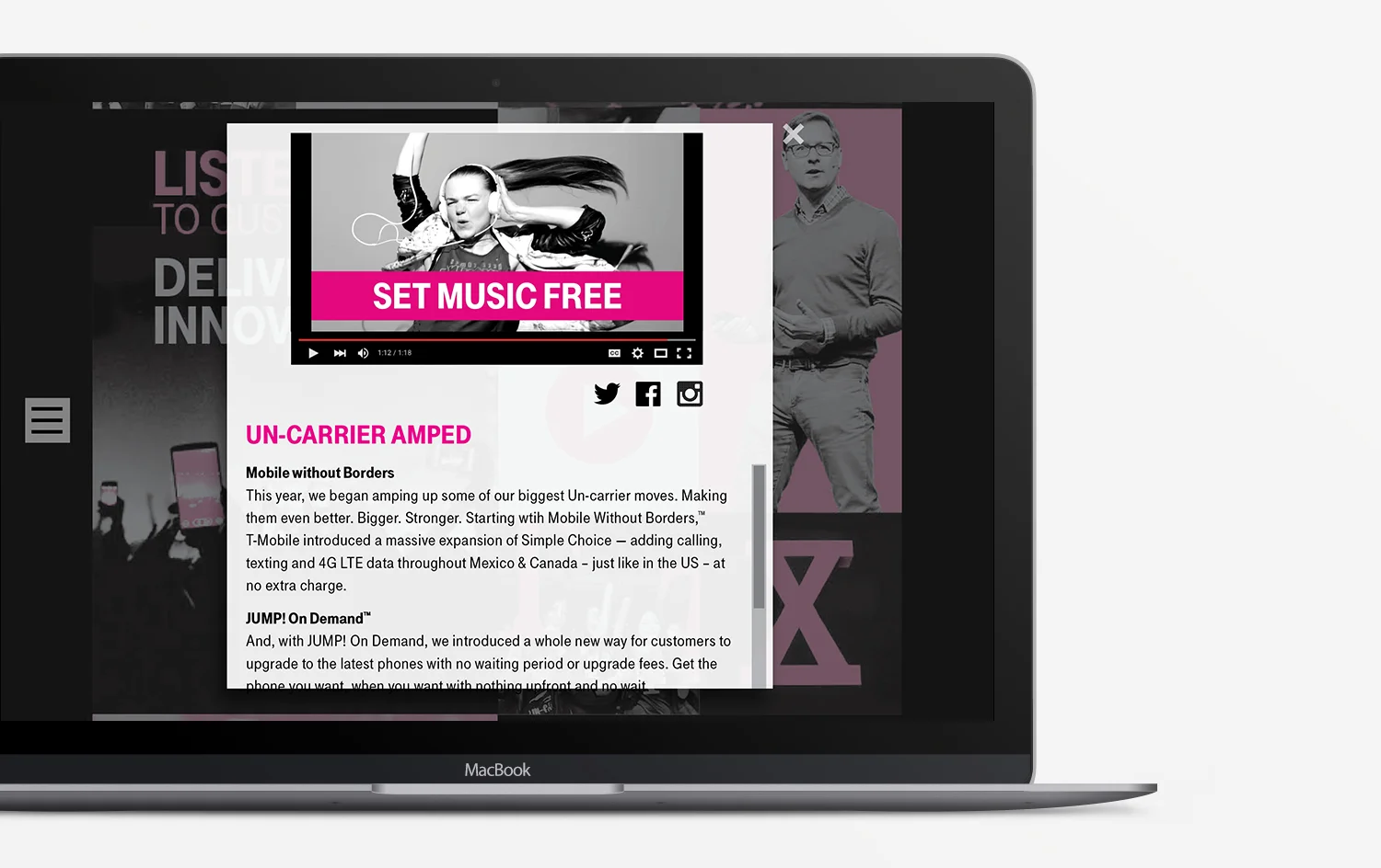
Using this scrolling grid layout allowed us to embed a lot of the content into clickable fields. Modal windows would pop up upon clicking, allowing users to engage with the content as they moved down the site.
This structure also allowed us to include some of the more fun social content - tweets, Instagram photos, videos - into the online annual report.
The block-grid design translated well to the mobile experience as well.